
Ting Orthodontics Dental Office
Ting Orthodontic Dental Office
Rancho Santa Margarita, CA
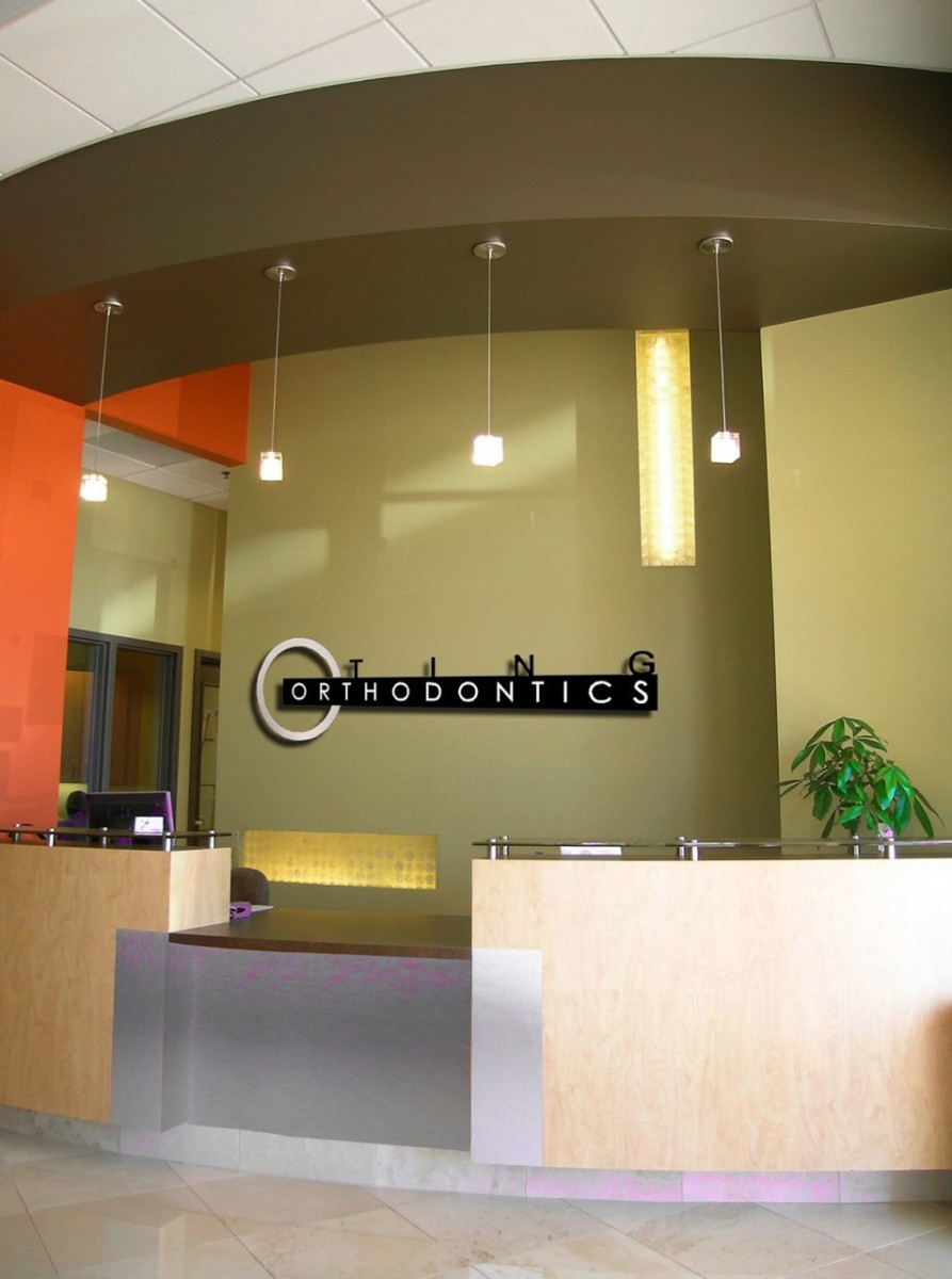
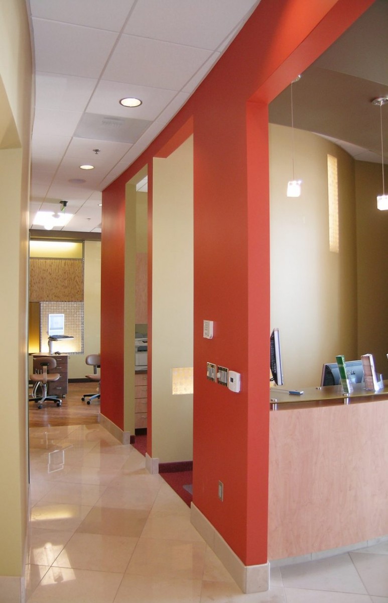
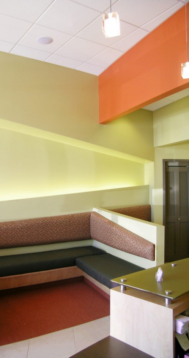
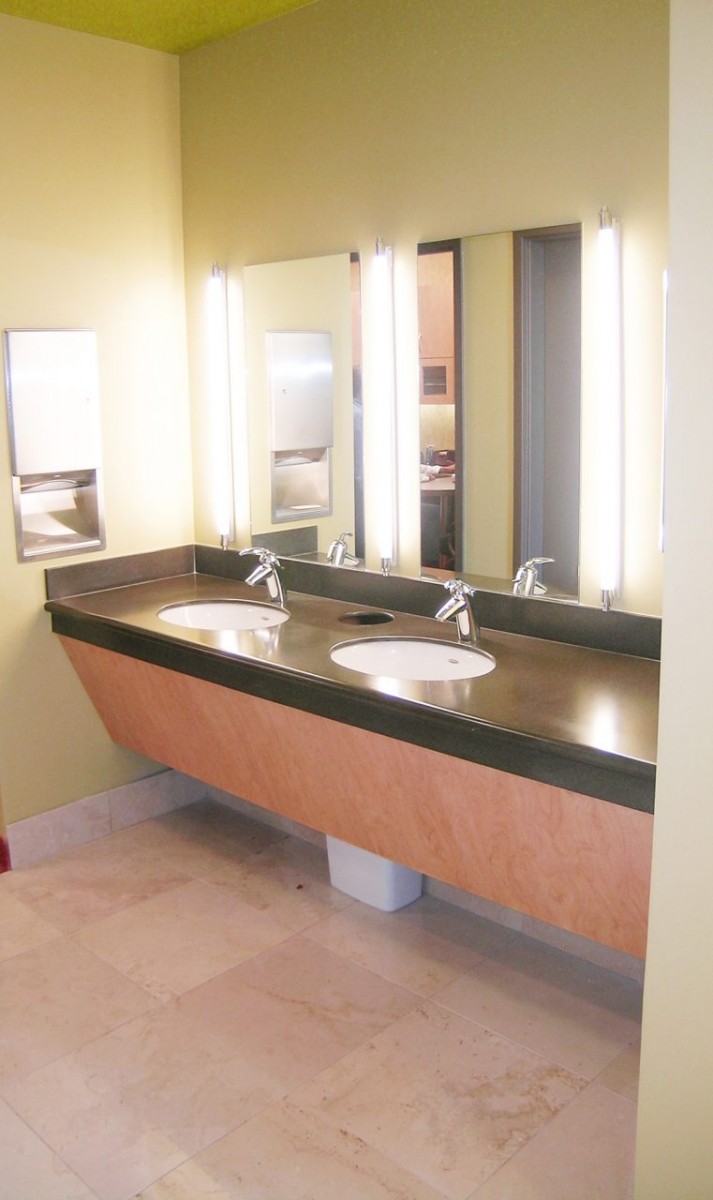
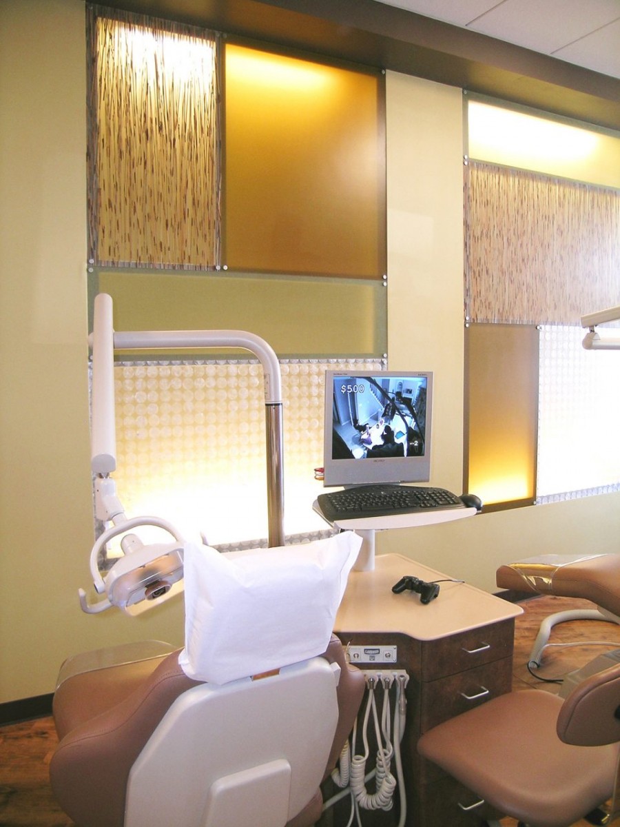
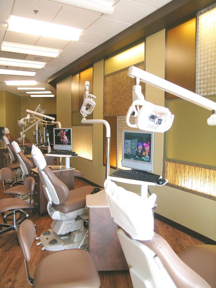
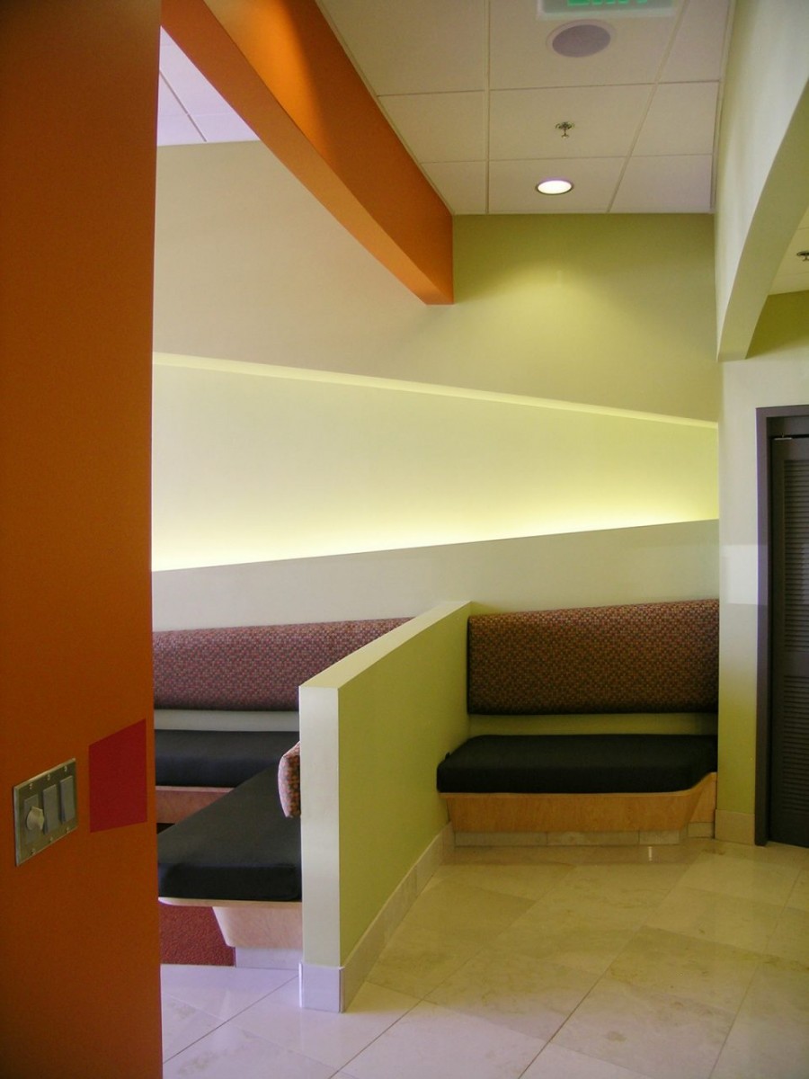
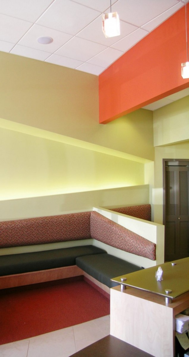
Ting Orthodontics in Rancho Santa Margarita, CA was designed to capture the energy and preferences of tweens and young adults—creating an orthodontic office that’s bold, modern, and full of personality. With soaring ceilings and expansive wall surfaces, Green Curve Studio took full advantage of the volume by layering bright accent colors, bronze-painted architectural headers, and warm base tones for a dynamic, upbeat environment. Backlit botanical resin panels add visual texture and softness, while the bold palette gives the space a sense of confidence and creativity—reflecting Dr. Ting’s vision for a practice that stands out in the competitive Southern California orthodontics market.
During a portfolio photo shoot, one moment summed it all up: a young boy entered the space, stopped in his tracks, and emphatically declared, “This is where I’m coming for orthodontics!”—foot stomp included. His mother suggested they look elsewhere, but he wasn’t having it. That spontaneous reaction says everything about the power of smart orthodontic office design to connect with its target audience. Ting Orthodontics is more than a treatment space—it’s a place where young patients feel seen, excited, and proud to begin their orthodontic journey.
Evergreen Takeaways – Ting Orthodontics, Rancho Santa Margarita, CA
- Design for the Audience—Especially When That Audience Is Youth
Bold colors, sculptural elements, and fun visual surprises speak directly to tweens and young adults. When the design aligns with their tastes, patients want to be there. - Volume Creates Opportunity
High ceilings are more than a structural feature—they’re a design canvas. Using headers, sculptural shapes, and color contrast helps anchor the space and direct the eye. - Playfulness Doesn’t Mean Immaturity
A well-designed orthodontic space can be playful and stylish at the same time. Contrasting bronze accents, clean architectural lines, and botanical resin panels gave this office youthful energy without compromising sophistication. - Brand Loyalty Can Start with Interior Design
If a space is memorable, patients emotionally attach to it. One stomp of a tween’s foot and “This is where I’m coming for orthodontics!” becomes the ultimate proof of design success.
Lessons Learned
- Don’t Be Afraid to Go Bold
In spaces designed for younger patients, strong colors and contrast are not only allowed—they’re expected. Playing it safe won’t capture attention or brand recall. - Capture Ceiling Height with Vertical Layering
Soaring ceilings can feel cold if left untreated. Strategic color blocking, headers, and layered lighting helped break up the height and make the space feel intentional and inviting. - Photo Shoots Reveal Emotional Truths
The spontaneous reaction from a young patient during the photo shoot reinforced that the design did exactly what it was meant to do: connect, impress, and stick in the memory. - Material Selection Supports Mood and Messaging
Botanical backlit panels softened the harder materials and brought in a feeling of natural calm—proving that decorative choices can also enhance comfort and brand personality.