
Medrite Urgent Care – 330 West 422nd Ave
Medrite Urgent Care
330 West 42nd Street, New York, NY
Medrite Urgent Care approached Green Curve Studio after being referred by an orthodontist client familiar with our ability to create interiors that deliver a unique and powerful brand statement. While Medrite already had several offices in operation, they wanted this new flagship location to elevate their brand identity and fuel further expansion.
Located on bustling West 42nd Street in New York City—where hundreds of people pass by each day—this project required a bold design that would capture attention and communicate Medrite’s presence as a trusted healthcare provider.
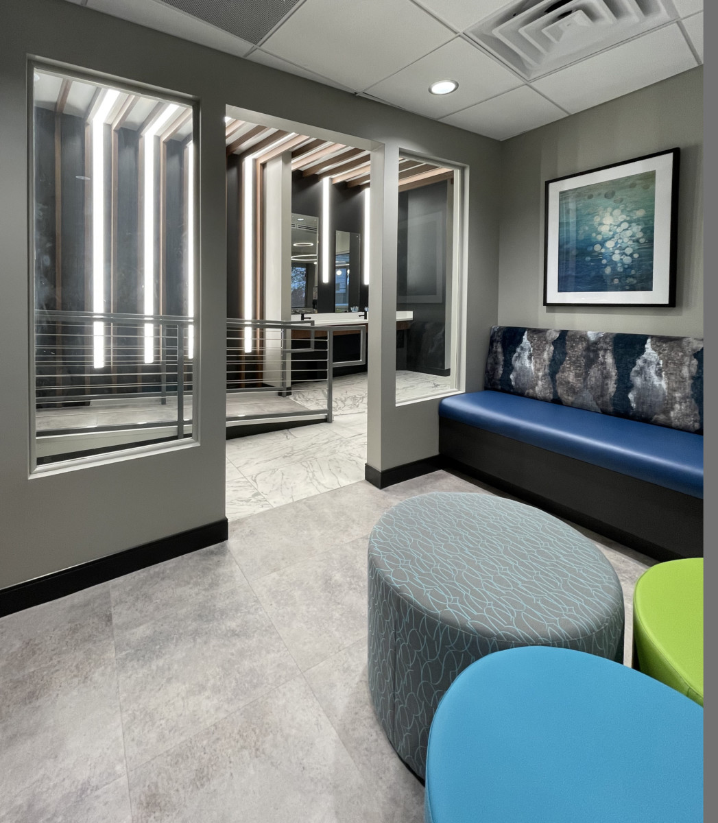
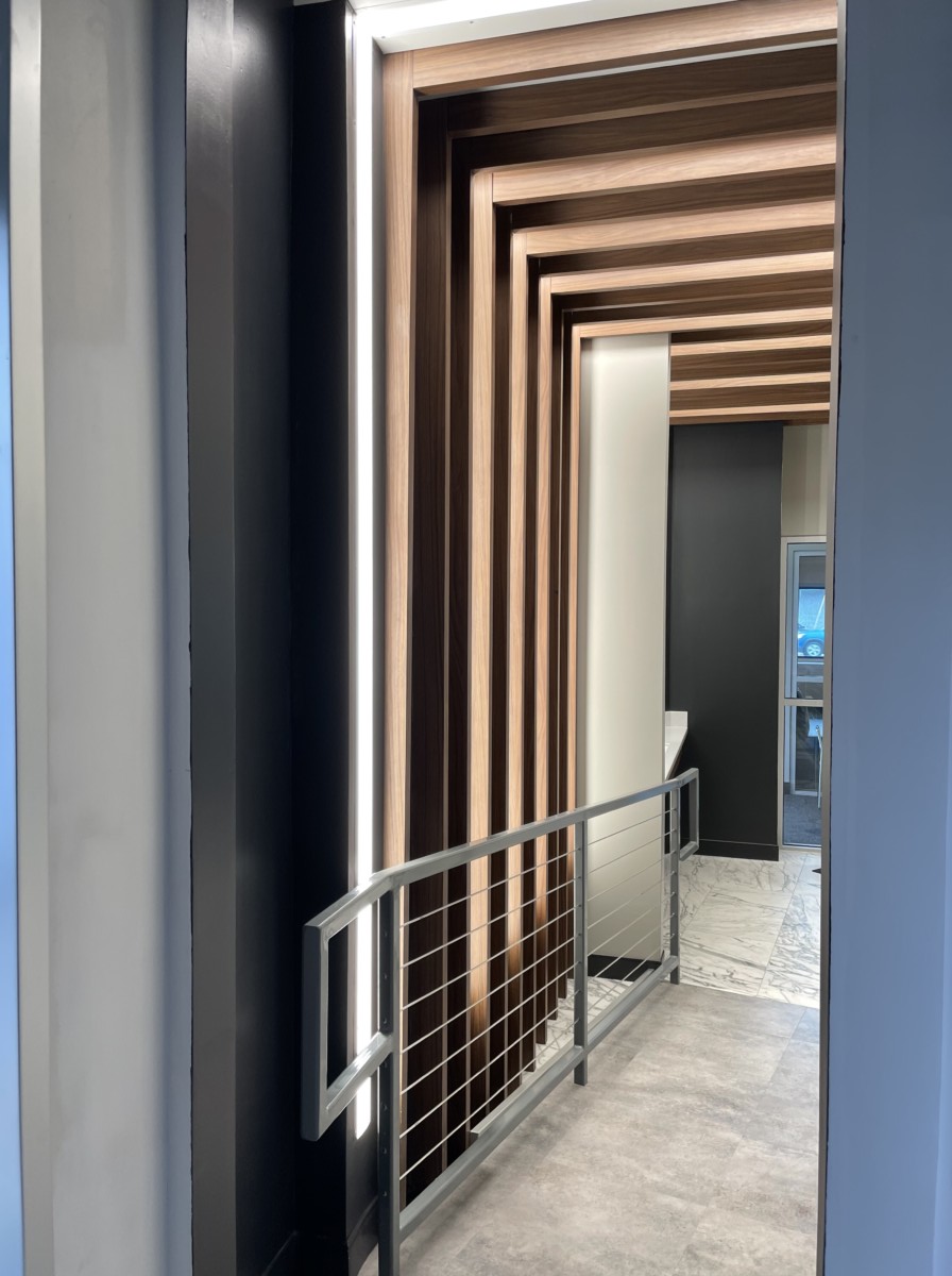
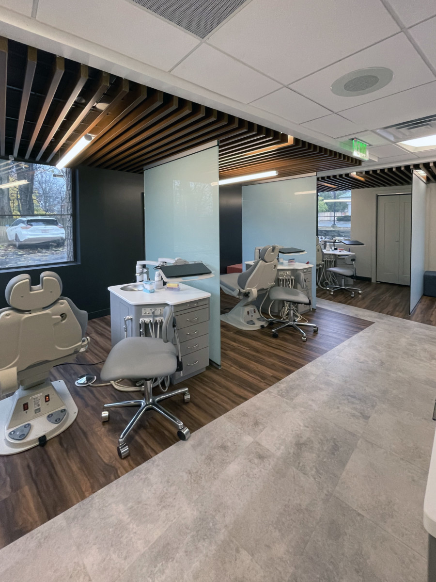
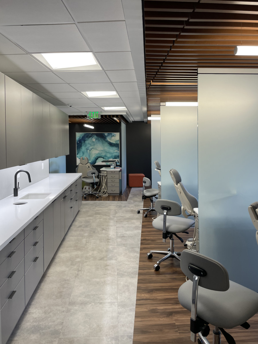
Our design team was brought in early and immediately reworked the architect’s original layout to maximize visibility. Instead of a secluded front desk, we reoriented the plan to spotlight the dramatic metallic indigo-blue logo wall through the storefront glazing. We introduced undulating linear and curvilinear wave soffits with integrated backlighting and uplighting, directing the eye toward a sculpted front desk that echoed the ceiling’s dynamic movement. These striking design details created a dramatic, brand-forward interior experience that turned heads on the busy avenue.
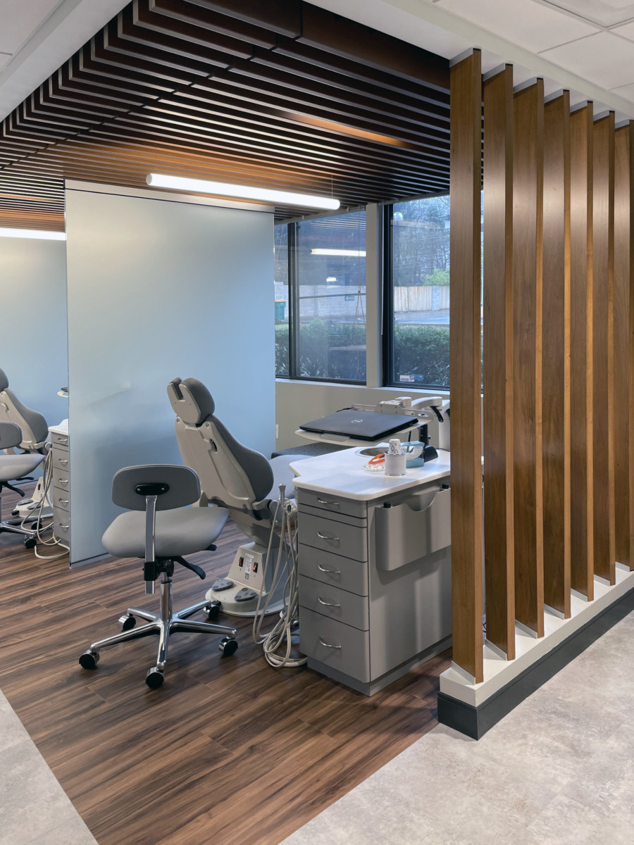
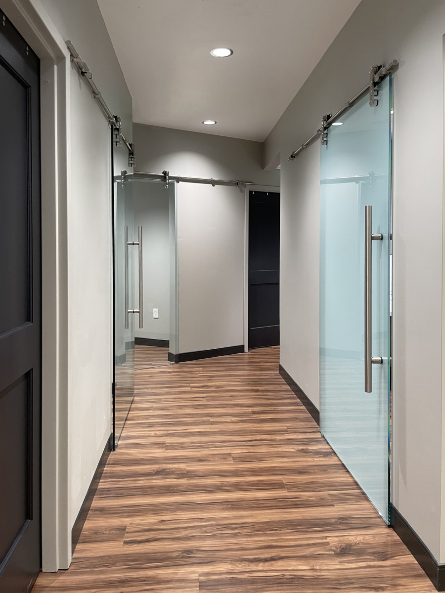
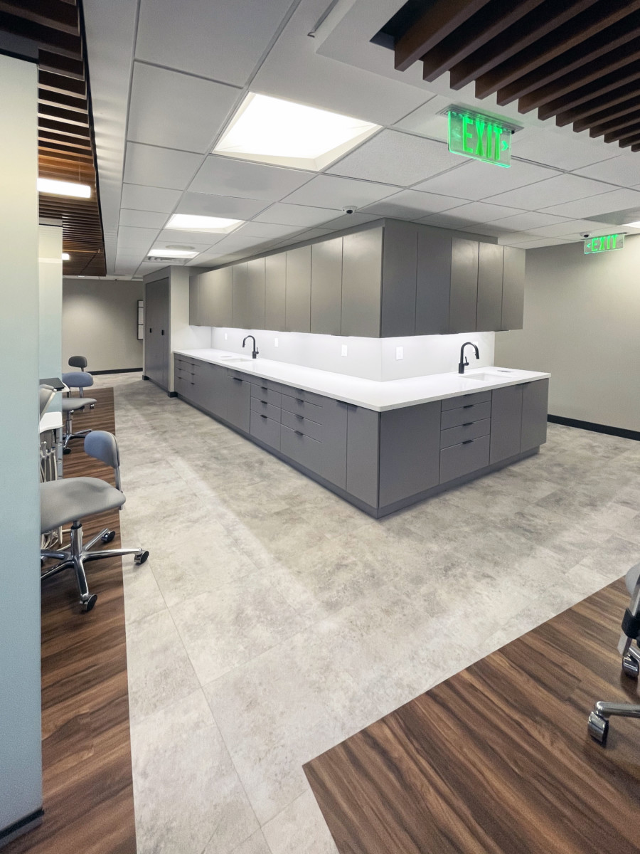
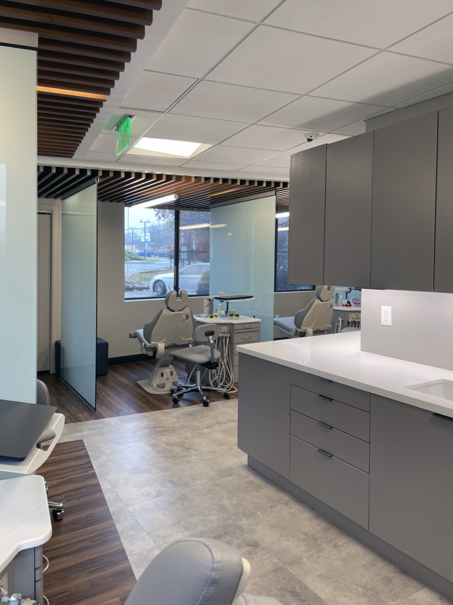
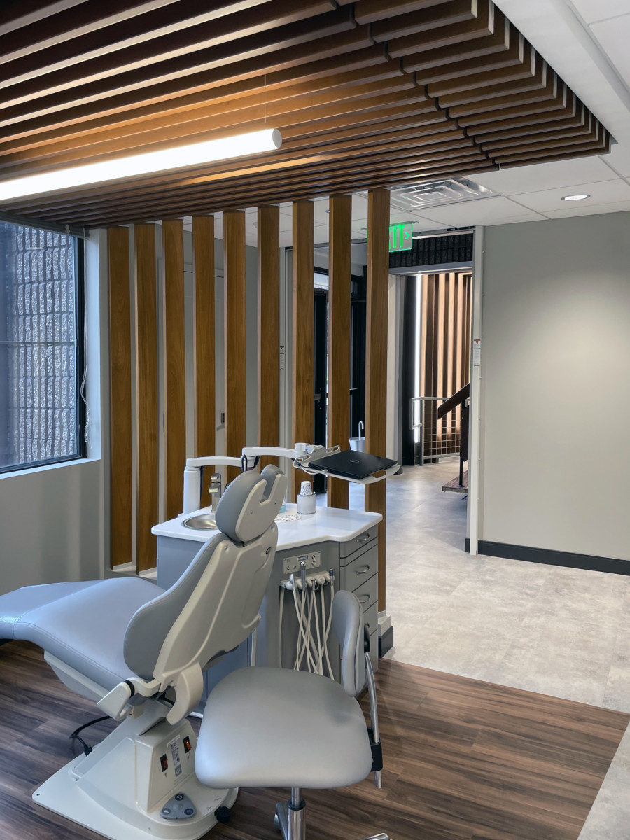
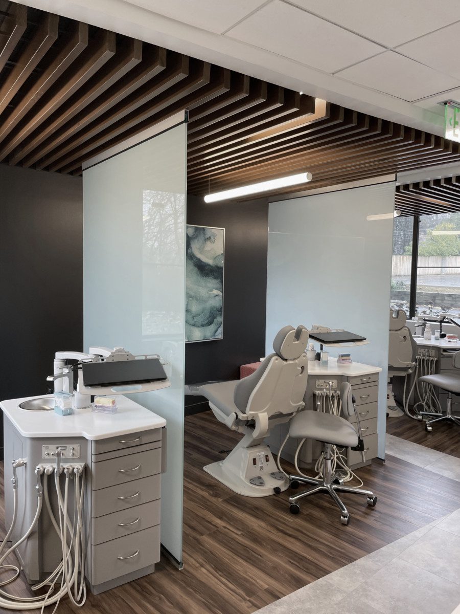
In addition to the public-facing brand environment, we played a key role in optimizing the clinical floor plan. Exam rooms were reworked for consistency and functionality, while the nurses’ station was strategically repositioned to a more central location to improve efficiency and staff workflow.
The result is a flagship urgent care interior that not only strengthens Medrite’s brand identity but also supports its operational goals—setting the stage for continued growth and expansion across New York City.
Evergreen Takeaways
- Brand-Forward Design Creates Market Visibility
In high-traffic urban locations, interiors should be treated as an extension of the brand. The wave soffits, sculpted desk, and illuminated logo wall turned Medrite’s office into a powerful marketing tool visible from the street. - Early Design Involvement Maximizes Results
Being brought into the project at the conceptual stage allowed our team to reshape the layout for stronger storefront exposure and better patient flow — changes that wouldn’t have been possible later in construction. - Balancing Drama with Functionality
While the public-facing spaces needed dramatic design elements, equal attention was given to the clinical areas. Reworking exam room layouts and relocating the nurses’ station improved efficiency without compromising the brand impact. - Healthcare Interiors as Growth Strategy
A carefully designed flagship office can help expand enterprise growth by broadcasting brand strength, improving patient experience, and setting a replicable standard for future locations.
Lessons Learned
- Visibility Drives Engagement
Positioning the logo wall to face the storefront was critical in leveraging the daily foot traffic on 42nd Street. Layout adjustments can significantly increase brand impact in urban settings. - Architectural Plans Need Branding Review
The original architect’s layout prioritized technical requirements but missed branding opportunities. Always review architectural plans with a branding lens to ensure the front-of-house reflects the enterprise vision. - Consistent Clinical Standards Save Time
Standardizing exam room layouts not only supports staff workflow but also helps create a repeatable model for future offices, reducing design and training inefficiencies. - Design-Driven Healthcare Attracts Trust
Patients interpret thoughtful, polished interiors as a reflection of the care they’ll receive. Investing in design is not just aesthetic — it’s strategic for building credibility and trust.
