Meru / Alter Orthodontics
Meru / Alter Orthodontics
Thousand Oaks, CA
Project Size: 1,800 sf - Remodel/Renovation
Design Category – Orthodontic / Pediatric Office Design
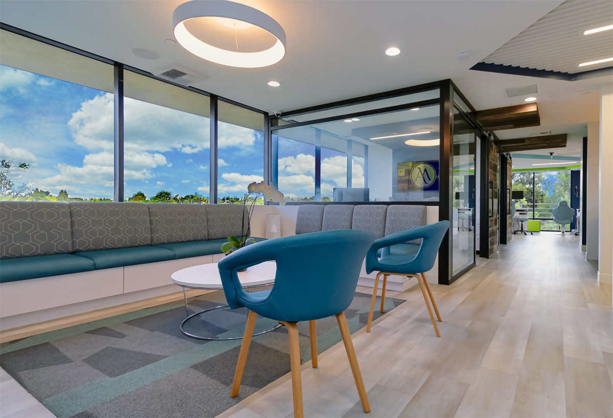
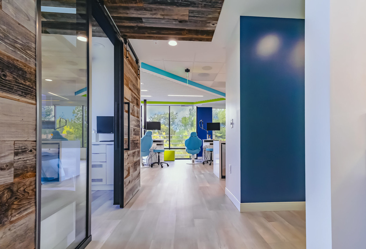
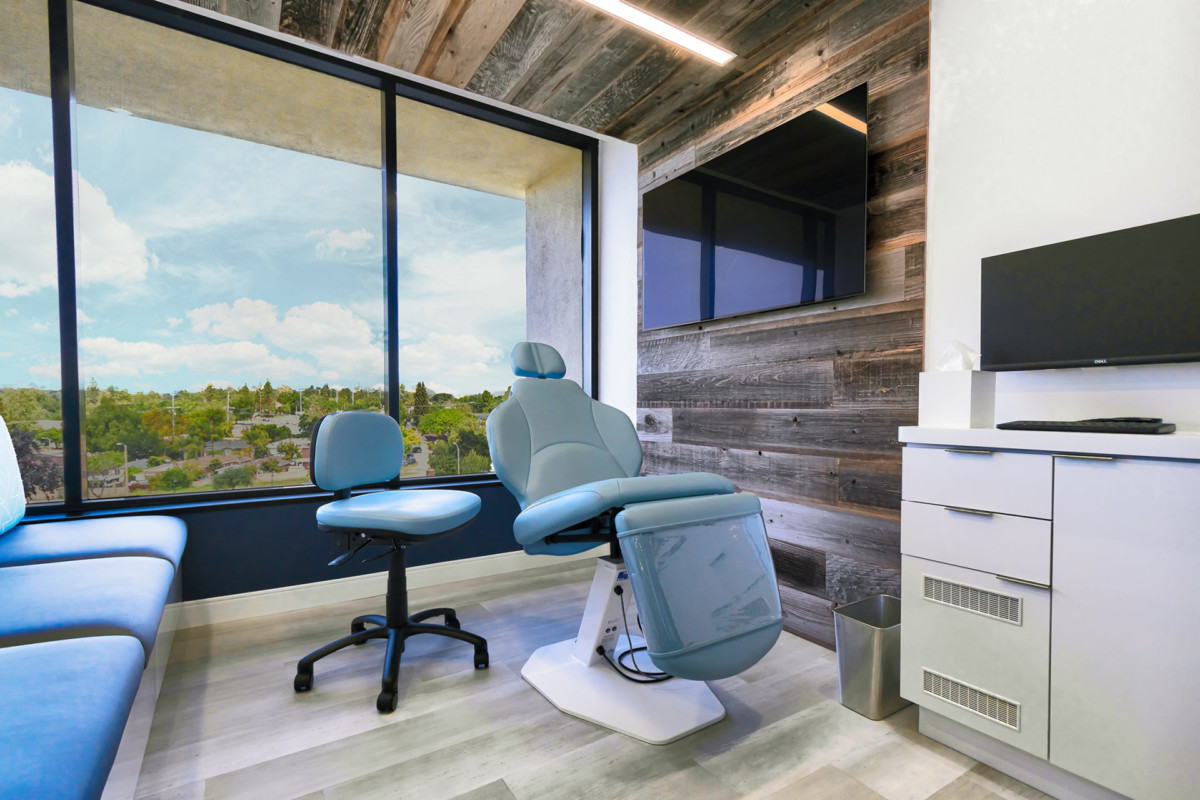
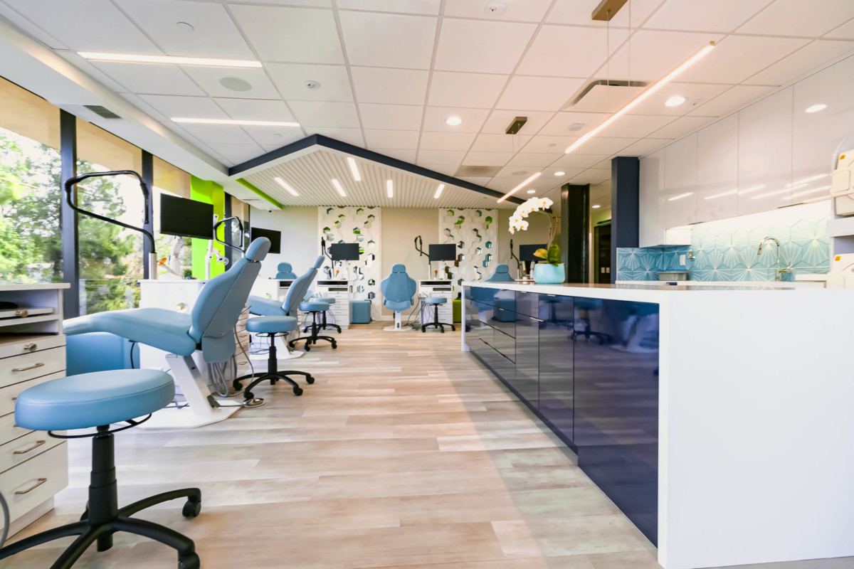
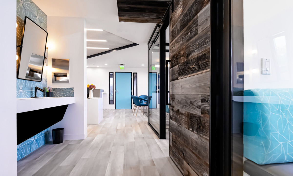
Meru / Alter Orthodontics in Thousand Oaks, California underwent a dramatic full remodel to transform their outdated office condo into a sleek, modern orthodontic practice. Owned by two orthodontists with a shared vision, the 1,800-square-foot space was reimagined from top to bottom using Green Curve Studio’s Take Charge Design & Admin program — a full-scope service that manages every step from planning and permitting to construction coordination.
This project, completed in 2021 on a budget of just $150 per square foot, is what we call a “day and night remodel”—a transformation that balances contrast, clarity, and visual rhythm. By leveraging smart material selections, flow-enhancing layout changes, and our structured contractor bid process, we helped the doctors achieve a high-end look without overspending.
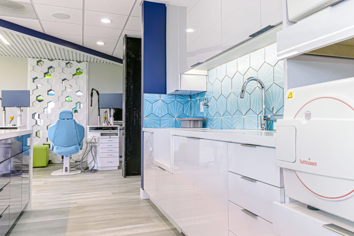
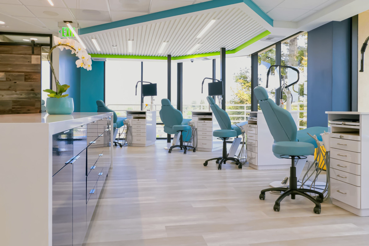
Every detail was curated to reflect the practice’s professional identity and improve the patient experience. A restructured reception and flow-enhancing hallway now lead to a fresh, open treatment bay, while new lighting, surface materials, and casework bring cohesion and elegance throughout. Custom elements, such as the brushing station and records alcove, were designed for both function and style—hallmarks of the Take Charge approach, where efficiency and aesthetics are always integrated.
Located in the heart of Thousand Oaks, this orthodontic remodel is a prime example of how the right design and project management strategy can completely revitalize a healthcare space—functionally, emotionally, and visually. The results are lasting, scalable, and a testament to what’s possible when expertise and vision come together.
Evergreen Takeaways – Meru / Alter Orthodontics, Thousand Oaks, CA
- A Strategic Remodel Can Feel Like a Brand-New Office
This “day and night” transformation shows how a thoughtful remodel can completely reframe an outdated space—improving not only function and aesthetics but also brand perception. - Design Harmony Is Possible with Dual Owners
Two orthodontists with shared but distinct visions can still create a cohesive outcome when the design team helps unify ideas around common goals—such as clarity, rhythm, and flow. - High-End Results Don’t Require a High-End Budget
With a smart $150-per-square-foot strategy, this project proves that budget-friendly doesn’t have to mean basic. Smart material choices and clear priorities led to big visual impact. - Contrast Adds Sophistication Without Complexity
By using contrast—between light and dark finishes, open and enclosed zones, soft textures and clean lines—the design elevates the experience without relying on ornate details.
Lessons Learned
- Flow Reconfiguration Pays Off
Restructuring the hallway and reception wasn’t just aesthetic—it directly improved patient circulation and team efficiency. Good flow reduces stress for both staff and visitors. - Lighting Should Be a Design Priority, Not an Afterthought
Upgrading the lighting was a game-changer in this remodel. Well-placed lighting enhanced materials, created rhythm, and added clarity to previously dark or underutilized areas. - Remodels Need a Clear Visual Language
When working with existing architecture, establishing a strong visual rhythm—through repeating elements, forms, or contrasts—helps stitch together old and new seamlessly. - Patients Notice More Than You Think
Subtle upgrades in materials, lighting, and layout can radically improve how a space feels, even if they go unnoticed on paper. Patient experience starts at the front door—and every touchpoint matters.