Author name: admin

Case Study

The Green Curve Team Rescues a Veterinary Office ​

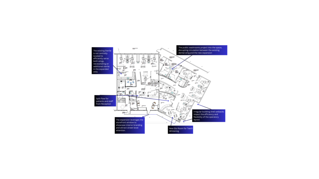
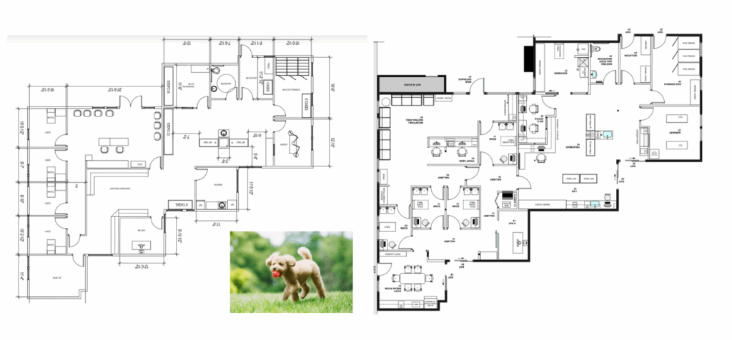
Ranch Heights Veterinary – Costa Mesa, CA​ Veterinary Office Interior Design & Floor Plan Optimization When this client signed with a contractor/architect team using a “design as you build” process, the priority was speed: rough out a floor plan, lighting layout, and electrical plan to get permits submitted quickly. Banks won’t release construction funding until permits are secured, so the contractor focused on the bare minimum to push the project forward. But “fast” plans often miss the interior details that make a medical or veterinary practice function — and fixing those issues later is far more costly. Green Curve Studio was brought in to evaluate the floor plan and elevate the interior design strategy before construction moved too far ahead. Before Floor Plan ​ The Green Curve Team – Rescue Plan A Problem Hidden in Plain Sight: Lack of Interior Detail A side-by side comparison of the plans showed a sharp contrast:  The contractor/architect plan included only the essentials required for permitting.  Green Curve plan added the critical interior layer – detailed casework, flow-safe adjacencies, treatment bay logic, lighting, storage solutions, ADA requirement, and efficient exam circulations. ontractor  These elements aren’t “extras.” They define how doctors, techs, and staff work every day – and directly impact the owner’s long-term return on investment.  Why Architects and Interior Designers Approach Projects Differently Most consumers don’t realize that architecture programs focus primarily on the building shell — structure, massing, circulation, and site planning. Interior design programs center on the human experience inside those shells: Detailed space planning Casework and millwork Lighting and ceiling strategy Codes and accessibility Furniture, finishes, and ergonomics   Architects may have one elective semester in interior design.Interior designers dedicate their entire curriculum to it.   That difference becomes obvious when you compare design drawings — especially in medical, dental, and veterinary environments where workflow is everything. Why Early Interior Design Involvement Protects Your Investment Many contractors hesitate to bring an interior designer into the early phase of a project.They worry it will slow permits or complicate coordination. In reality, the opposite is true when you hire an experienced team. A skilled interior design team: Customizes the floor plan for efficiency Develops ceiling and lighting solutions that align with medical/veterinary needs Prepares detailed electrical/IT plans that move smoothly through permitting Advances casework, storage, and finish selections during permit review Prevents costly change-orders by resolving conflicts early While permits are under review, we keep the momentum going — so construction can start cleanly, without stop-and-start delays that waste time and money.   Interior design is not about “picking finishes.”It’s about improving performance, reducing risk, and giving contractors everything they need to build accurately on day one. The key is choosing a design team with the technical depth, portfolio, and reputation to carry a project from concept through construction.   Planning a Veterinary or Medical Office? Don’t Settle for a Generic Plan. Your layout is the engine of your practice.A generic contractor plan can’t deliver: Proper zoning Efficient staff movement Containment of noise and odor Treatment room ergonomics Seamless client flow Storage where it’s needed most   Green Curve Studio specializes in floor-plan optimization and detailed design documentation that reduces change orders, shortens construction time, and protects your investment.   Let’s make sure your project starts strong. Ready for a professional layout evaluation before you move to the next phase?  Don’t settle for a generic plan. Our team specializes in floor plan optimization and detailed design strategies that save time, reduce change orders, and protect your investment. Let’s Chat about your project.”

Dental office remodel
Case Study

A Dental Office Expansion Remodel – From 2,250 sf to 3,900 sf

When a thriving dental practice grows, the excitement is real—so are the challenges. Expanding your square footage, adding operatories, and introducing new services requires far more than simply attaching extra rooms. It demands strategic planning, seamless flow, and design expertise grounded in years of dental-specific experience.   One of Green Curve Studio’s long-term clients recently expanded their dental office from 2,250 square feet to 3,900 square feet by incorporating an adjacent suite. The remodel included: Five new dental operatories (ten total) A dedicated two-chair dental whitening spa An aesthetic refresh to bring the entire practice into a modern era   As the original designers of the practice in the early 2000s, Green Curve Studio was invited back to create a unified, contemporary environment that would support patient growth, elevate workflow, and protect the client’s construction investment. Design Challenge: Expand the Practice While Controlling Construction Costs Remodeling and expanding simultaneously requires a careful balance. Our goal was to preserve as much of the existing infrastructure as possible to minimize downtime and cost—while still creating a modern, efficient, and visually cohesive dental office. The expansion came with several key challenges: Integrating old and new spaces without a visible separation Improving operator flow and circulation Modernizing the early-2000s aesthetic Upgrading front-of-house spaces to compete with today’s dental market Our team approached the dental office remodel with a strategic workflow analysis, exploring multiple layout options to optimize ergonomics, patient movement, and production capacity. As the original designers of the practice in the early 2000s, Green Curve Studio was invited back to create a unified, contemporary environment that would support patient growth, elevate workflow, and protect the client’s construction investment. Contemporary Dental Office Design: A Unified “Modern-Day Spa” Experience The transformation began with the reception and front-of-house areas — critical spaces for shaping first impressions. Preserving What Worked, Elevating What Didn’t The practice’s original faux wood beams became a design anchor. Instead of removing them, we refined them with a charcoal finish and extended the detail into the newly added space, creating visual continuity. To soften the darker tones, we introduced: Flooring in soft blues, warm taupes, subtle greys, and caramel hues Updated paneling with deep grey finishes Contemporary lighting with warm, spa-like illumination The result? A rich, modern-spa aesthetic that feels calm, upscale, and distinctly different from its early-2000s roots. A Reimagined Reception Area With Modern Impact The expanded reception area became the heart of the transformation. Key Features: A curvilinear front desk finished with mosaic tile, warm wood, and stainless steel Modern pendant lighting that creates a bright, inviting glow A newly clad double-sided fireplace with stone, stainless steel, and bronze accents Lounge seating including sculptural end tables, indigo blue upholstered banquettes, and modern chairs These elements delivered the fresh, contemporary dental office design the practice was ready for—while maintaining a welcoming, approachable feel for patients. Smart Material Integration That Protected the Construction Budget The expanded reception area invites guests with a curated mix of modern lounge chairs, sculptural end tables, and custom curved banquettes upholstered in rich  The operatories already featured earth-toned laminates and finishes in excellent condition. Instead of replacing these, we specified: A carpet with grey and caramel tones that tied the operatory finishes to the updated public spaces New flooring and paint colors that complemented existing casework A fresh palette of sky blue, white, caramel, and indigo to unify both old and new areas This approach allowed us to modernize the entire space without unnecessary material replacement, significantly reducing total construction cost. Showpiece Addition: The Two-Chair Glo Whitening Spa Positioned along the glass storefront, the new Glo Spa creates instant visual impact for anyone passing by. Features include: Sparkling charcoal, black, and white mosaic tile Purpose-designed lighting A calm, luxurious atmosphere that differentiates the practice Strong visibility to attract new patients The whitening spa elevates the brand, supports new revenue streams, and sends a clear message: this is a modern dental office committed to comfort and exceptional experience. With a fresh palette of sky blue, white, indigo, and caramel, the space makes one thing clear—Early 2000s Starbucks never happened. The newly revived front desk, expanded reception area, and pièce de résistance—Glo Spa—take center stage along the glass storefront, showcasing sparkling charcoal, black, and white mosaic tile that stops passersby in their tracks. The Outcome: A Dental Office Expansion Designed to Grow With the Practice This remodel and expansion delivered: Optimized workflow and circulation A refreshed aesthetic aligned with modern dental design trends A seamless connection between old and new spaces A spa-like atmosphere that elevates the patient experience A cost-controlled upgrade through strategic material reuse   Green Curve Studio transformed a dated interior into a cohesive, modern, high-performance practice—one that will support this dental team through its next decade of growth. Forward to a Friend

Creating a Rustic Mountain Lodge Kitchen Design
Case Study

Creating a Rustic Mountain Lodge Kitchen Design

Transforming a Lower-Level Kitchen: A Smart Residential Design Solution When a smart general contractor suggested the homeowner hire an interior designer for their lower-level kitchen remodel, the goal was clear: create a functional and independent living space for the homeowner’s sister, her husband, and their pet dog. The lower floor, located in a two-story residence with stunning views of Mt. Hood and Mt. St. Helens, was already equipped with a large yard and a swimming pool. However, the layout needed a significant redesign to better suit the needs of the new residents. Contractor Recommended Guest Room as Kitchen Location For one, anyone using the kitchen in the middle of the night would need to travel quite a distance to grab a snack. Furthermore, converting the bedroom into a kitchen would eliminate the guest room where grandchildren slept during visits, a space that was conveniently located next to a bathroom. This plan left little room for flexibility in the layout and failed to consider the convenience and accessibility that would best serve the needs of the residents. The Initial Plan: A Bedroom Conversion for a Functional Kitchen LayoutThe contractor’s initial suggestion was to convert an existing bedroom into a kitchen. The location, directly beneath the first-floor kitchen, seemed practical for construction, as it was close to existing plumbing. However, placing the kitchen in this far northeast corner of the lower level came with a series of challenges. Our Design Solution: A Central Kitchen After visiting the site and carefully considering the options, our team proposed a much more practical and accessible solution: relocating the kitchen to a more central position in the space. Upon inspecting the property, we discovered that the utility room, which shared a wall with a large storage room, had the potential to become the perfect location for the new kitchen. The shared wall contained ample plumbing for the “wet wall” in the kitchen, and by moving the laundry room into the storage area, we could share the plumbing wall between the new kitchen and laundry, drastically reducing plumbing costs. This new kitchen layout, designed in a galley style, allowed the kitchen to be centrally located within the space. It was now easily accessible from all areas of the home, including the Rec Room and swimming pool, making midnight snacks a breeze. Creating a Rustic Mountain Lodge Feel To further enhance the design and tie the space to its stunning natural surroundings, we decided to create a rustic mountain lodge aesthetic. We exposed the fir wood ceiling deck and floor joists, giving the space a warm and inviting atmosphere. This feature not only added visual interest but also helped bring the outdoors in, echoing the majestic views of Mt. Hood and Mt. St. Helens just beyond the windows.The natural wood tones beautifully complemented the modern kitchen layout, offering a perfect balance of rustic charm and functional design. Collaborating with the Plumber: Efficient Plumbing Design for Kitchen Remodel To ensure that our design worked seamlessly with the existing plumbing, we scheduled a walk-through with a plumber early in the process. This step was crucial in confirming that our proposed layout would connect to the existing sewer lines, minimizing the need for saw cutting, trenching, and other expensive construction processes. This attention to detail was key in keeping costs manageable while still delivering the quality of design that the client expected. Master Bath Remodel: Increased FunctionalityWhile the kitchen relocation was a major component of the redesign, the master bath also required significant updates. The homeowner had complained about the cramped shower and the inconvenient access to the bathroom, which required going through the rec room.To address these concerns, we proposed a complete overhaul of the master bath. We enlarged the shower, relocated the toilet to a more private area, and added a his-and-her sink. We also ensured direct access from the master bedroom, while retaining the second entrance for added convenience. By tapping into the shared plumbing wall, we were able to reduce the costs of tearing out existing structures, minimizing both the disruption and expense of the remodel. “Transforming Storage Into a Walk-In Closet for Master Bedroom Additionally, we transformed the existing storage area into a walk-in closet, accessible both from the master bath and the master bedroom. The Transformation of This Independent Living Space Creating a Rustic Mountain Lodge Kitchen Design To further enhance the design and tie the space to its stunning natural surroundings, we decided to create a rustic mountain lodge kitchen aesthetic. We exposed the fir wood ceiling deck and floor joists, giving the space a warm and inviting atmosphere. This feature not only added visual interest but also helped bring the outdoors in, echoing the majestic views of Mt. Hood and Mt. St. Helens just beyond the windows.The natural wood tones beautifully complemented the modern kitchen layout, offering a perfect balance of rustic charm and functional design, creating a seamless transition between modern kitchen design and rustic accents. Key Takeaways: Functional and accessible kitchen layout: Centralized kitchen design provides convenience for all areas of the home, including the Rec Room and swimming pool. Rustic mountain lodge aesthetic: Exposed fir wood ceiling and joists create a warm, inviting atmosphere that complements the property’s natural beauty. Cost-efficient design: Collaborating with plumbing experts ensured that our redesign minimized construction costs while maintaining a high level of quality. Master bath remodel: Improved accessibility, functionality, and comfort through thoughtful design choices such as enlarging the shower and relocating fixtures. The Importance of Hiring an Experienced Design TeamHad the homeowner not hired our experienced design team, there’s a high chance that the guest bedroom would have been converted into a kitchen, a decision that would have created major inconveniences for the family. By considering every detail, from layout and plumbing to accessibility, we were able to deliver a solution that met the client’s needs and exceeded their expectations.In the end, this project demonstrated how thoughtful design can transform a space into something truly functional and beautiful, while also avoiding

Orthodontic office lobby with angular wood trellises, sculptural geometry, and layered lighting — Kadan Orthodontics, Devon PA by Green Curve Studio.
Case Study

Transforming an Impossible Space Into a Modern Orthodontic Office: Kadan Orthodontics, Devon PA

“How did Green Curve Studio turn an aging bank building—uneven floors, code issues, missing plans, and a blown construction bid—into a sophisticated orthodontic office that exceeded patient sign-up projections during COVID? This case study explains the layout strategy, design solutions, ADA fixes, construction cost rescue, and final project outcome.” THE BEAST/BEFORE Turning Challenges Into Opportunity for an Orthodontic Office Design in Devon, PA When Kadan Orthodontics purchased an old bank building in Devon, PA, they needed more than a remodel — they needed a strategic orthodontic office design that could overcome a long list of structural challenges while still achieving a modern, club-like brand experience. This project quickly became a standout example of how expert orthodontic office design Devon PA can transform even the most problematic spaces. Step 1: Revealing the Real Conditions (As Built Plans) Because the aging bank had been expanded over the years, nothing was straightforward — or documented. To begin developing a code-compliant orthodontic office design, we conducted a full As Built analysis to understand: multiple floor elevation changes structural limitations affecting layout efficiency the center-located stairway second-floor code restrictions fire-rating and ADA requirements Accurate As Builts ensured the orthodontic office design could meet both function and compliance before any construction dollars were spent. Step 2: Designing a High-Performance Orthodontic Office Layout in Devon, PA With 3,400 sq ft of main-floor space to reimagine, we developed several layout options that improved patient flow, supported staff efficiency, and elevated the practice’s brand identity. smooth patient and staff circulation efficient sterilization workflow a modern treatment bay privacy and sound control visual balance and branding consistency Design Language: Sophisticated, Angular, Modern The client envisioned a modern, club-like atmosphere. Green Curve delivered an orthodontic office design featuring: angular wood trellises layered ambient and indirect lighting deep wood tones for warmth white and grey marble contrasts circular fixtures to soften strong architectural angles This orthodontic office design in Devon PA strikes a balance between sophistication and comfort — reinforcing the patient experience the doctor wanted to create. Our team developed 3 layout options Step 3: Protecting the Client From a $400/sf Construction Bid A major turning point came when the contractor submitted a $425/sf bid, far exceeding the $225/sf budget communicated at the start of construction. The client was told simply to “get more money.” Instead, he sent the bid to Green Curve Studio. Cost-Control Expertise That Protects Your Investment We stepped in and performed a full forensic review of the contractor’s bid: eliminating inflated line items removing duplicate charges correcting miscalculations clarifying material assumptions negotiating directly and firmly on behalf of the client The outcome:We brought the contractor back down to $225/sf, making the project financially viable — and protecting the client from tens of thousands in unnecessary costs. This phase is the hallmark of our Take Charge Design & Management program:strategic orthodontic office design + disciplined construction oversight. Step 4: A Modern Orthodontic Office in Devon, PA That Opened With Remarkable Success Despite strict COVID-19 restrictions during its opening month, Kadan Orthodontics exceeded projections — signing 20 new patients in the first 30 days. This success was supported by: efficient orthodontic workflow design optimized patient circulation strong visual branding a comfortable, upscale environment intuitive staff routing and functional storage Your orthodontic office design directly impacts patient perception, staff efficiency, and practice growth — and this project proved that again. Final Layout A modern orthodontic office lobby featuring angular wood trellises and layered indirect lighting for Kadan Orthodontics in Devon PA. Client Testimonial: Dr. Sam Kadan, DMD “Turning an old bank into a modern orthodontic office was a huge challenge, but Green Curve Studio made it seamless. The building had structural issues, missing documentation, and was not up to code. Susanne and her team navigated every obstacle with clarity and confidence. When my contractor submitted a shocking $425/sf bid, Green Curve reviewed it line by line. They caught overcharges and negotiated it back to $225/sf. My practice exceeded projections from day one. Their expertise saved me a significant amount and delivered an incredible office.” Thinking About an Orthodontic Office Design in Devon, PA or Beyond? A well-planned floor layout protects your investment, your workflow, and your long-term growth. THE BEAST/AFTER Add Your Heading Text Here Thinking About Building or Remodeling Your Orthodontic Office?  A well-planned floor layout protects your investment, your workflow, and your long-term growth.Before you sign with a contractor or finalize a design—get a professional evaluation. Forward to a Friend

Case Study

Don’t let a Bad Floor Plan Ruin Your Dream Orthodontic Office

A Costly Surprise: “How floor planning bugs ” Can Became a Construction Nightmare Don’t Let a Bad Floor Plan Ruin Your Dream Orthodontic OfficeBuilding a new orthodontic practice should be exciting—not a minefield of unexpected construction problems. Yet for many doctors, that’s exactly what happens when early floor plans contain hidden errors. One common scenario: construction begins, the contractor calls, and suddenly the space is 16 inches narrower than shown on the plans. A small error becomes a major crisis. Costs rise. Timelines slip. Stress skyrockets.   This type of mistake is far more common than doctors realize—and completely avoidable with an expert review. The Hidden Risks in Orthodontic Office floor Plans According to industry research and our own project history, over 85% of field revisions originate from underdeveloped or inaccurate floor plans.Common issues include: 1. Inaccurate or Assumed Measurements Even a 1–2 inch measurement error can compound into a full re-framing requirement once walls go up. 2. Poor Space Utilization Awkward cabinet placement, wasted window lines, and inefficient work zones lower productivity and increase long-term frustration. 3. ADA Compliance Failures Incorrect restroom dimensions or clearances can stop permitting in its tracks and delay your opening by weeks or months. 4. Equipment Supplier Layout Pitfalls Many orthodontists receive “complimentary” layouts from equipment suppliers.These often: Misplace the entrance Waste valuable natural-light zones Ignore patient flow Miss ADA requirements Are stamped Not for Construction, transferring liability to the doctor Real-world example: One supplier-provided plan positioned a back entrance in the wrong location, wasted the prime window line on administrative staff, and placed Sterile in a location that disrupted the treatment bay’s workflow.   These oversights almost always lead to expensive revisions during construction.   How Green Curve Studio Transforms Flawed Floor Plans Using our specialized orthodontic workflow system, we corrected the issues above and delivered a functional, efficient, high-impact design. Our improvements included: ✔ Relocating the Main Entrance Positioned at the front for a powerful first impression with dramatic ceiling details and a bold logo wall. ✔ Reworking the Front Desk & Admin Zone Ergonomics, storage, and line-of-sight optimized so staff can work efficiently without congestion. ✔ Correcting ADA-Noncompliant Washrooms Ensuring construction approval and protecting against future liability. ✔ Streamlining Treatment Bay Flow Organized chair layout, proper cabinetry integration, clinically efficient pathways, and balanced patient privacy. ✔ Centralizing Sterile Placed for maximum workflow efficiency while keeping clutter out of the patient line-of-sight. ✔ Creating Dedicated Doctor & Staff Entrances Clear separation of patient circulation and staff/clinical movement. These corrections prevented construction delays, expensive re-framing, and long-term workflow issues. By catching mistakes early through thorough and precise evaluations, Green Curve Studio helps orthodontists avoid costly and stressful delays. Why Critical Errors Are So Common in Orthodontic Plans We frequently review layouts from: Equipment suppliers General practice architects Local draftsmen Designers without orthodontic specialization These plans often look “fine” at a glance but hide major workflow, compliance, or measurement problems. Because they’re provided at low or no cost, they skip the most important part:deep diagnostic review and careful layout analysis. How We Caught a Major Dimensional Error—From Out of State Clients often ask: “How did you catch this if you’re not local?”The answer: process, not proximity. Before layout begins, we: Compare all provided drawings to original building plans Verify critical dimensions Cross-check against site photos, surveys, and structural documents Identify inconsistencies between sources In one case, an equipment supplier drafted plans using incorrect measurements. Each person who touched the file afterwards unknowingly compounded the error. Because we cross-verified against original building documents, we caught the 16-inch discrepancy immediately and prevented a full re-framing. Orthodontic Floor Plan – Before Orthodontic Floor Plan After by Green Curve Orthodontic office floor plan, project located in Tampa, FL Pediatric Dental/Orthodontic Floor Plan – Before by others Pediatric Dental/Orthodontic Floor Plan – After by Green Curve Pediatric Dental/Orthodontic office floor plan, project located in Clifton, NJ How to Know Whether Your Designer or Architect Is Truly Qualified With modern technology, it’s easy for inexperienced designers to create polished websites with realistic 3D renderings—even if the projects have never been built. Common red flags: Only one or two medical/dental projects in their portfolio No photos of completed projects, only renderings Vague claims like “We specialize in dental” without proof Drawings stamped “Not for Construction” with no disclaimer explained No detailed questions about workflow, ergonomics, sterilization, or clinical sequencing Bad design won’t physically harm a patient—but it will harm your budget, production capacity, workflow, and long-term peace of mind. Q&A: Your Most Common Orthodontic Floor-Plan Questions   Who pays for re-framing when dimensions are wrong? If you forwarded a “Not for Construction” layout to your contractor, you typically assume the liability. Most doctors don’t know this—and only discover it after demo is complete.   Are critical layout errors really that common? Yes. Roughly 8 out of 10 orthodontic layouts we review contain at least one serious issue.   What’s the biggest cause of construction delays? Underdeveloped floor plans lacking critical detail for mechanical, plumbing, electrical, and cabinetry coordination.   Can bad layout decisions affect my practice long-term? Absolutely. Poor flow can permanently limit production, increase staff fatigue, and diminish patient experience. Before you submit for permits or start construction, get a professional Layout Evaluation.It can save tens of thousands of dollars and months of stress.   Often, equipment supplier drawings come stamped with “Not for Construction” disclaimers. Yet, if you accept these layouts and pass them on to your contractor or architect you’re effectively taking ownership of any errors within them. By relying on a thorough, documented process instead of physical proximity, we caught the mistake early—saving valuable time, money, and frustration. Before you submit for permits or start construction, get a professional Layout Evaluation.It can save tens of thousands of dollars and months of stress. Schedule Your EvaluationDesign Your Interior. Grow Your Life. We’ve Got This. Forward to a Friend

Scroll to Top

Please fill out the required information.